Manipulation - Part I
Bee wanted to know about the image in yesterday's post and I know many of you artsy-types love process posts. So here's the process.
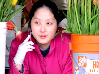
1. I started with a photo I took at the Pike Place Market on Mother's Day. It's kind of soft-focus and isn't a perfect shot, by any means. But the young woman was lovely, cell phone to her ear, looking wistful and transported to another world. In a perfect world, there would have been a few more tulips visible and the one hanging over her shoulder could have been a hue that didn't blend in to her sweatshirt, but shooting on the fly you take what you get without being able to fuss over the details.
So, having decided that I wanted to play with the image, I jumped in.
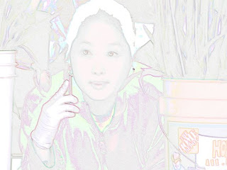
2. In Photoshop, I went to Filters>Stylize>Find Edges. You'll get a really washed-out looking result, with edges showing but the rest of the image pretty light in color. I was looking for something more intense and reminiscent of woodblock prints.
 (By the way, this is my Idiot's Guide to Manipulating Photos in Photoshop Without Using Layers, a Skill I've Not Yet Mastered But I Have a Book.)
3. Next, I went to Image> Adjustments>Exposure. I moved the sliders so they were as follows: Exposure +0.7, Offset - 0.250, Gamma 3.50. That basically got the darkened, grainy look I was after.

4. From there, I went to Image> Adjustment>Hue/Saturation and bumped up the saturation to about+.50. That added a little bit of color intensity to work with.

5. I still wasn't happy with the results, so back to Image> Adjustments> Exposure. Because the file had been saved, the new settings were at 0 for each, rather than the settings from step 2. Therefore, I left Exposure at 0 because I didn't want it lightened, moved Offset to -0.0100 to darken it just a bit, and Gamma to 1.22 to intensify the colors.

6. Finally, I wanted to add a little of painted color in. Using the paintbrushes and a purple (R 144, G100, B149), I painted a light wash of the purple over the greyish-purple parts of her sweatshirt (at 40% opacity and 100% flow), adjusting the size of the brushes to keep the wash localized to the greyish-purple parts, while preserving the greens and pinks, etc. Next I sampled the reddish-pink on the left of the tulip hanging down by her shoulder. Using a watercolor style brush, I painted the left half or so of the tulip with that color, then darkened it a bit to paint the right section so it would have some shadow. Then I added a spring green in selected areas to highlight the foliage.
 "Arrangements" copyright 2009 Meri Arnett-Kremian
And voila, you have the version posted. Now you, too, can do crazy things to your photos using Edge Finder.
In a separate post, I'll show you some other versions of the same photo, manipulated with filters from Photoshop, Microsoft Digital Image Pro (which is no longer made, so I prize my copy), and Corel Painter Essentials 4.
1. I started with a photo I took at the Pike Place Market on Mother's Day. It's kind of soft-focus and isn't a perfect shot, by any means. But the young woman was lovely, cell phone to her ear, looking wistful and transported to another world. In a perfect world, there would have been a few more tulips visible and the one hanging over her shoulder could have been a hue that didn't blend in to her sweatshirt, but shooting on the fly you take what you get without being able to fuss over the details.

So, having decided that I wanted to play with the image, I jumped in.
WARNING: Manipulating photos can suck
all your spare time into a black hole.
all your spare time into a black hole.
2. In Photoshop, I went to Filters>Stylize>Find Edges. You'll get a really washed-out looking result, with edges showing but the rest of the image pretty light in color. I was looking for something more intense and reminiscent of woodblock prints.
 (By the way, this is my Idiot's Guide to Manipulating Photos in Photoshop Without Using Layers, a Skill I've Not Yet Mastered But I Have a Book.)
3. Next, I went to Image> Adjustments>Exposure. I moved the sliders so they were as follows: Exposure +0.7, Offset - 0.250, Gamma 3.50. That basically got the darkened, grainy look I was after.

4. From there, I went to Image> Adjustment>Hue/Saturation and bumped up the saturation to about+.50. That added a little bit of color intensity to work with.

5. I still wasn't happy with the results, so back to Image> Adjustments> Exposure. Because the file had been saved, the new settings were at 0 for each, rather than the settings from step 2. Therefore, I left Exposure at 0 because I didn't want it lightened, moved Offset to -0.0100 to darken it just a bit, and Gamma to 1.22 to intensify the colors.

6. Finally, I wanted to add a little of painted color in. Using the paintbrushes and a purple (R 144, G100, B149), I painted a light wash of the purple over the greyish-purple parts of her sweatshirt (at 40% opacity and 100% flow), adjusting the size of the brushes to keep the wash localized to the greyish-purple parts, while preserving the greens and pinks, etc. Next I sampled the reddish-pink on the left of the tulip hanging down by her shoulder. Using a watercolor style brush, I painted the left half or so of the tulip with that color, then darkened it a bit to paint the right section so it would have some shadow. Then I added a spring green in selected areas to highlight the foliage.
 "Arrangements" copyright 2009 Meri Arnett-Kremian
In a separate post, I'll show you some other versions of the same photo, manipulated with filters from Photoshop, Microsoft Digital Image Pro (which is no longer made, so I prize my copy), and Corel Painter Essentials 4.

Comments